Posts

Showing posts with the label Ancillary Tasks

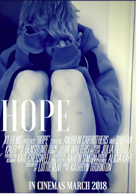
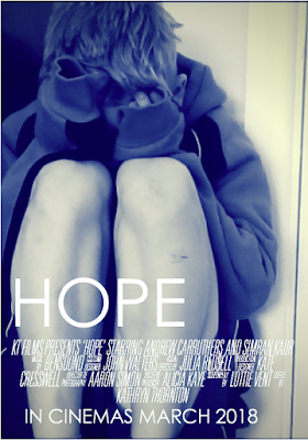
Ancillary Task 1: Final Film Poster

Image
Here is my Final Film poster for my Ancillary Task:

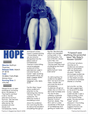
Ancillary Task 2: Magazine Review page

Image
Here is my Final Magazine Review Page for my Ancillary Tasks:

Draft Poster

Image
I have had trouble editing the size of the credits for my poster to promote my short film. The credits at the moment are too big and the gap between the titles and the credits is too big. This I what I have done so far: 

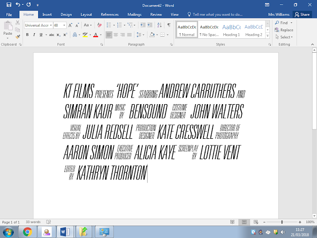
Font for my poster

Image
Here is the font I am going to use for the credits on my poster:  Overall, I found it very difficult to initially download to font 'Universal Accreditation' as I had to complete many steps in order for the font to be used of Microsoft Word. Once downloaded, it took a while to work out how to use the font on Microsoft Word. I eventually realised to write the credits such as; 'Edited by' and 'Music by' I had to click on one letter for the whole credit to come up. In order to type normally I had to select the key 'Caps lock' to write the names of the 'crew' who participated in the making of my short film. 

Photoshop and Word

Image
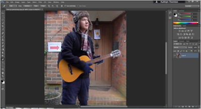
I used photoshop and Word in order to practice how to cut the person out of my picture. Firstly, I used  the photo cutting tool in photoshop around my photo. This was very precise, but it took a long time to work out how to use the tool. Here is a screenshot of the process I went through to cut out the photo: I then tried to cut out the photo on Microsoft Word. I found this easier to use than photoshop as all I had to do was colour what parts I wanted to cut out and what parts I wanted to keep. This tools was not as precise as Photoshop as it was very difficult to colour between his fingers and between the guitar. However, if I take more time doing it I could make the photo cut out more precisely.  Here is the final result of cutting the photo out on Word. I still think the result on Word is good even though the cut out needs to be more precise.

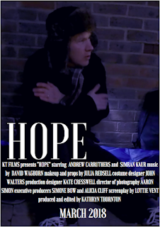
Poster idea

Image
I have created two rough outlines for posters, to promote my short film: Here is the first one:  Second idea:  I like to second one more, because the background picture is very effective and the filter reflects the atmosphere of the film. Moreover, the design is quite simple but effective. Whereas in the first poster, the photo is less effective and the quality is not as good as the second poster. Therefore, I am more inclined to use the second poster to promote my short film.
Updated Rough Magazine Review Page

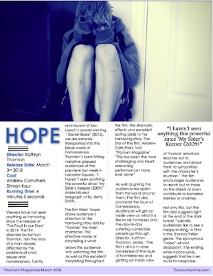
Image
Here is what I have done on my Magazine Review page so far:  I initially wrote and designed my Magazine review page on Microsoft word, however, I updated what I had done to the website canvassing, which was more useful and allowed me to create different designs for my Magazine review page. However, I did experience some difficulty creating the conventional black lines to go above and below the film information, I eventually worked out how to create them and they worked really well with the rest of my Magazine review page. 

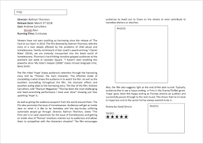
Rough Outline of Magazine review

Image
Here is my rough Outline of my Magazine review page for the film 'Hope':