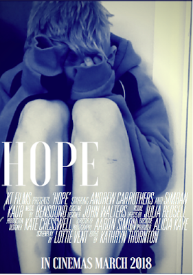
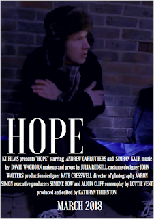
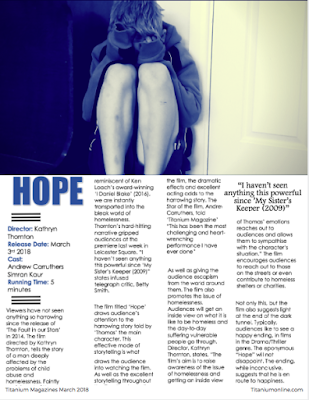
Posts

Showing posts from March, 2018

Audience Feedback

Image
Yesterday afternoon I showed my short film to a small focus group and asked them to fill in feedback forms with ratings out of five and comments. Here is an overview of all the marks I got for my feedback. One of the main criticisms of my Short Film was that the music was too repetitive. After receiving this feedback I went back to my short film and listened closely to the music. However, I have decided to keep the music as it does reflect the repetitiveness of my characters life and does effectively contrast to the atmosphere of the short film as a whole. Also, most audience members also said how the little amount of colour grading was effective as it made it more realistic and reflected the mood of the short film. They said that lots of colour grading would have ruined the message of the short film as a whole. Overall, I am very pleased with the feedback I got for my film, and the feedback of what I could do better was very useful: 

Change in film genre

Image
Initially, my short film was going to be a Thriller/Drama, however, after drafting and filming it, I realised it settled more into the Drama genre than in the Thriller Genre. Therefore, my short film is in the Drama genre.  

Draft Poster

Image
I have had trouble editing the size of the credits for my poster to promote my short film. The credits at the moment are too big and the gap between the titles and the credits is too big. This I what I have done so far: 

Rough Cut for Film Opening

Image
Here is a rough cut for my Film Opening

Font for my poster

Image
Here is the font I am going to use for the credits on my poster:  Overall, I found it very difficult to initially download to font 'Universal Accreditation' as I had to complete many steps in order for the font to be used of Microsoft Word. Once downloaded, it took a while to work out how to use the font on Microsoft Word. I eventually realised to write the credits such as; 'Edited by' and 'Music by' I had to click on one letter for the whole credit to come up. In order to type normally I had to select the key 'Caps lock' to write the names of the 'crew' who participated in the making of my short film. 

Music

I wanted guitar music to go over the top of my short film. I looked on the website bensound.com and found a piece of guitar music called - A Day To Remember. It is upbeat as well as sad which fits the atmosphere of my short film. The music is not entirely uplifting, but contrasts greatly to the atmosphere of the film. It does reflect the positive ending as well.

Photoshop and Word

Image
I used photoshop and Word in order to practice how to cut the person out of my picture. Firstly, I used  the photo cutting tool in photoshop around my photo. This was very precise, but it took a long time to work out how to use the tool. Here is a screenshot of the process I went through to cut out the photo: I then tried to cut out the photo on Microsoft Word. I found this easier to use than photoshop as all I had to do was colour what parts I wanted to cut out and what parts I wanted to keep. This tools was not as precise as Photoshop as it was very difficult to colour between his fingers and between the guitar. However, if I take more time doing it I could make the photo cut out more precisely.  Here is the final result of cutting the photo out on Word. I still think the result on Word is good even though the cut out needs to be more precise.

Poster idea

Image
I have created two rough outlines for posters, to promote my short film: Here is the first one:  Second idea:  I like to second one more, because the background picture is very effective and the filter reflects the atmosphere of the film. Moreover, the design is quite simple but effective. Whereas in the first poster, the photo is less effective and the quality is not as good as the second poster. Therefore, I am more inclined to use the second poster to promote my short film.

Updated Rough Magazine Review Page

Image
Here is what I have done on my Magazine Review page so far:  I initially wrote and designed my Magazine review page on Microsoft word, however, I updated what I had done to the website canvassing, which was more useful and allowed me to create different designs for my Magazine review page. However, I did experience some difficulty creating the conventional black lines to go above and below the film information, I eventually worked out how to create them and they worked really well with the rest of my Magazine review page. 

Rough Outline of Magazine review

Image
Here is my rough Outline of my Magazine review page for the film 'Hope':

Empire Magazine

Image
The Empire Magazine Reader states that its target audience and the readers are '3/4 male between the ages 18 and 40, employed, university educated, time-poor and in a relationship'. Therefore most of the articles and advertisements for various films found in the magazine would be catered for this type of audience. For example; films such as 'X-Men' can be advertised in the magazine, therefore conforming to the needs of the magazines target audience.  Furthermore, Empire Magazine shows the importance of advertising films that are going to persuade its target audience to go and watch it. The magazine uses colour schemes as well as different pictures from the film itself in order to advertise effectively. Therefore providing the audience with information, news and entertainment of their favourite genres of films.  Here are examples of the types of advertisements that the Empire Magazine produce:  In these two advertisements, the colour scheme is mainly dark bl